Thursday, 9 May 2013

4.In what way does your media product use, develop or challenge forms and conventions of real media products?


This is my audience profile and it shows all the things that my audience like. My magazine is aimed at males who are around 17-25 year olds. I created a survey using Questionpro and used the results to create an image board of all the things which my demographic like. The images on the audience profile can also help know who I’m aiming my magazine at and what types of things I should be using my magazine, like what types of buzz words, artist and colour for my magazine.
I placed this survey in different social websites to get a huge sample and removed results which Isn’t useful for my magazine like the data females gave and people under my demographic and over my demographic.
 I placed key statistics about my audience; this information can be used by companies to advertise their product to appeal to my demographic. If a company wants to create a new game for males aged 17 -25 they can use my results and findings. The key statistics can help me shape my magazine to appeal to them, knowing how many of my audience have jobs can help me decide how much I should sell the magazine. The highest key statistics is ‘playing video games’ which is 28%, with this information I can post adverts of different games which appeal to my demographic, product placement can help me receive some revenue as I’m not using a major publishing to publish my magazine, this is fully explained in question 3.

Wednesday, 8 May 2013

Final Media Product


Flat plan


7. Looking back at your preliminary task, what do you feel you have learnt in the progression from it to the full product?


As you can see, my preliminary task is not been designed well, it’s doesn't look like it’s been made
by a professional either. This is because I did not plan and research my target audience. The demographic for the preliminary task was teachers, students and parents, I didn't not research this demographic and I had not planned when creating this school magazine, that’s why it’s not in a professional standard. In the preliminary task my target audience was a huge group of different people which have different styles, it was difficult creating a school magazine which appeals to all three demographic. In my magazine I was given a choice of a specific target audience which made it easier to appeal to, the type of music they like, colours, words, the typographic, tone of language.
 I placed all my research and results in a presentation and created an audience profile which made understand what types of things I should include in my magazine and what types of things my audience wanted. This allowed me to create and construct a more professional magazine because I was finding ways of communicating to my target audience.

 When creating my music magazine I learnt different theories, codes and conventions which all helped me construct my media magazine, I also learnt different techniques which helped me understand how to create a professional music magazine. I used Photoshop to create a hyper reality image, something which doesn't exist and is not real, this theory was said by a social theorist called Jean Baudrillard. Another theory which I used was Maslow’s hierarchy of needs, Maslow said that humans have needs which need to be filled, starting from the bottom which is the physiological stage where humans need food, water and shelter and the last stage which is humans need to reach their full potential which is the self-actualization stage. To reach their full potential they need to dream and aspire which my music magazine helps sell that dream.
When creating my preliminary task my Photoshop skills lacked and didn't know how to use most of the tools and filters. After some practice and tutorials, my skill level increased allowing me to create a magazine which has different filters and effects. This all helped me produce a much better product which is professional and appeals to my target audience.


6. What have you learnt about technologies from process of constructing this product?


I used a range of different techniques to construct my music magazine. I first used the internet to create a survey so that I can find out more about my target audience. This would allow me to know what features and information I should include in my music magazine. To get the information I placed the survey on social network website like Twitter and Facebook, to get more accurate and reliable data I placed the survey on Hip hop and Rap forums to help me get the results I wanted. QuestionPro was free and easy accessible which allowed me to create my survey and post it online really quickly. 
I also used Photoshop cs6 to edit and manipulate the pictures I took for my magazine. I wanted to create something perfect so that it looked and met the standards of my choosing.  This is called ‘hyper reality’ the image I created doesn’t existed it’s not real it’s just a simulation of reality; Jean Baudrillard came up with this theory.
Photoshop CS6 allowed me to add filters and change the contrast, brightness and tone of the image to give it more of a professional look. I wanted to create a magazine which looked simple but still have complex design. Using features like the image slicing tool to create one image and turn it to many, and the brush features allow me to create amazing images like air brushing which look real there are also elements of 3D editing in my magazine. I used this feature because I wanted to add better texture and add lighting to the images I took.
The issues I had with Photoshop were that it crashed a lot when I was trying to edit it multiple images for my magazine. Trying to get the right design and placing objects in the position I wanted them to be in was really difficult, this made me change my ideas about what I should include in my magazine and what things I should remove.


5.How did you attract/address your audience?


The images I used in my magazine allowed to me to attract my audience, by creating a hyper real image that my target audience dream and aspire to, my magazine is able to sell them the dream. The way I represented the artist on the main cover also helped attract my target audience, my magazine changed the ideology of hip hop and rap artist are gangsters, wear really baggy clothes and sag the trousers. I changed that meaning by portrayed this artist by look smart and wearing a suit, I challenged that stereotype of hip hop and rap artist on my music magazine.

I also used freebies or incentives which attracted my audience to my magazines like free steam codes which could only be activated when they visit my magazine website and type the code in, this is called synergy when using other media platforms to work together. My target audience can subscribe to my website and they can receive additional features like more images which are not on the magazine. As I’m using online publishing as my distribution for my magazine I can give digital copies and   Another thing I have done is that I gave my target audience a free digital copy of my magazine demo so that they can read a few pages which can also attract them to my magazine.
Some other theory’s which I used in my music magazine is the uses and gratifications theory. I included entertainment, social interaction and information in my magazine. I used buzz words like ‘exclusive’, ‘New’, ‘Trill’ and ‘Cool’ they make my magazine more entertaining, attract the audience with words which appeal to them and this makes them feel a step closer to their dreams. To reach more of my target audience I placed social network sites like Twitter, Facebook, YouTube and Instagram on my magazine, this increases social interaction where i can communicate with my target audience. I can post images on the magazine Facebook page, tweet and speak to some of the audience using twitter and I can allow exchange to take place by using Instagram by asking the audience to send in their pictures to be used in the ‘top fan of the month’ article in my magazine. Upload exclusive interviews with artists on YouTube, unseen footage of artists doing things in their daily life. Since my magazine is about hip hop and rap there would be a group of people which will talk about my magazine and they would be engaged with my magazine, this creates a sense of community.  There Is also a lot of information in my magazines which is about new music coming out in the next few months, new hip hop and rap artist which are about to become huge, new music videos which are out and which are the top hip hop and rap artist of the month. This informs my target audience and they can be updated with what’s going on in the hip hop and rap genre.


3.What kind of media institution will distribute your media product?


Major magazine publisher are
      
IPC Media are the UKs leading consumer magazine and digital publisher here some of the magazines they publish
·         NME
·         Nuts
·         LOOK
·         Country Life
And a lot more


IPC Media is owned by time Inc. and they are a consumer magazine and digital publisher in UK and they sell over 350 millions of copies each year.
They can reach a larger audience and can get my magazine to more people, they can print a lot more copies as they have the funds. My magazine would be on the top shelves in shops which allow more people to see it. This allows me to give free discounts and allows me to place my magazine on the top shelves of stores. I can give a free preview of my magazine like the first few pages which allow sales for my magazine to increase. With major publishers they can use vertical and horizontal integration which allows major publishers to distribute their products in the marketplace to which gives them more power.
The problems are that it going to be a competitive market as other music magazines compete with one another and that my magazine might not be able to compete with the NME or other music magazines. IPC produce a lot of different magazines which can be hard to even place in the marketplace and get IPC to publish my music magazine

With indie publishers It would be more creative and would have a lot more quality but they might not be able to print more copies because they would be lacking funds and it might be hard for my magazine to be seen by more people and it would be hard for me to make money of my magazines as I gave to pay a lot to the indie publishers. Indie publisher are in a disadvantage as they can’t pay for all the exclusive features that major publisher have like allowing discounts and placing magazine in the front of shelves.
Some indie music magazine are Fader which focus on underground and upcoming artists. Fader hosts events and music festivals with upcoming artists and some mainstream artists.

However online magazines would be a lot cheaper and my magazine would be free! I would use social network sites to help me promote my magazines and people can view it for free but I would place ads to help me generate revenue. By placing the magazine on my website I can use social media to get attention. I can then make my magazine compatible with Mobile phones as more people are getting smart phones.
As my magazine is not being published by a major company I can’t give free discounts and try and place my magazine in the front spot. I can try and place it on other website which have the same audience type as my magazine which also can help me gain more people reading my music magazine and this would allow me to generate more money as adverts would be placed around my music magazine. I can also ask other online based companies to place ads on their websites so that more people can visit my website and read the music magazine.

2. How does your media product represent particular social groups?


My media product represents a group of males aged 16 – 25 years old, and to represent this demographic I needed to use the right tone to address my target audience. I wanted to make sure that my magazine appealed to them, and the way I meet my target was by using the right typography, colour scheme and design.
I chose the colours Red, Black and White because they are masculine colours and they represent strengths and power, I wanted to make my target audience feel in control when reading my magazine. The text within the magazine is in all capital and this is reinforce the idea of being in power, this applies to my demographic. The buzz words and typography within my pages all represent my demographic as its words they use in their daily life, I wanted to aim my magazine to males which like to play video games and listen to rap and hip hop music, to appeal to them I need to use words which they would use so that my media product would be successful. There is not a lot of media magazines which caters for my demographic and it’s a niche audience, to gain there attention I made sure that i used the right tone of address.
As my media product was aimed at the hip hop and rap music genre, the stereotype for hip hop and rap is related to crime and trouble, and I wanted to change that stereotype because it doesn’t appeal to my audience, the main featured artist wore a suit, this conveyed a different message to my audience. Hip hop and rap artist usually wear baggy clothes. With the help of Photoshop, I was able to create images which appealed to my demographic, and take away the stereotypes which was connected with hip hop and rap music. 

1.In what way does your media product use, develop or challenge forms and conventions of real media products?


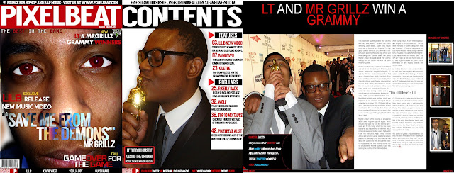
In my music magazine I have followed the codes and conventions of other magazines. I have also developed some of the codes to make it more appealing to my demographic which is the mode of address of my magazine. Codes and conventions in magazines include things like the main image, banner and featured stories; I have developed and altered the forms of magazines to create a specific magazine design which appeals to my target audience. Some of the conventions I used in my magazine are that I placed featured stories and articles in my magazine on top banner. Most magazines follow this form to keep the layout of the magazine simpler to navigate.

I have used my signs and symbols in my magazine to help me construct and convey that my magazine is masculine like the size of my masthead and words I used to appeal to my demographic semiotics is the study of signs and symbols and the sign system. In my contents page I have used the ‘play’ symbol on my featured stories this is sign and its becomes  an iconic symbol this  helps me convey that not only does it mean play but its shows what’s next and what’s coming up in the future.

The masthead design of my music magazine is similar to the XXL music magazine, XXL music magazine audience like Hip hop and rap. This helps me convey the message to my audience that Pixel beat is also a hip hop magazine. My magazine is a formulaic cover. It has most of the traditional looks of music magazine, the main colour scheme is red,black and white which is used a lot in hip hop and rap magazines. The name Mr Grillz is a common artist name in the Hip-hop and rap genre, but he is wearing a suit which challenges the codes and conventions of rap artist. The image of rappers is all about doing bad things and having lots money; my magazine is contradicting this idea and is creating a new image for young rappers. The typography for my magazine is big and it’s in blocks, you can see that this magazine is for males because it’s so powerful and dominate, the next biggest font is the main featured story which is also in big and in blocks, and this also helps to reinforce that it’s a masculine and for males.

My magazine colour scheme stays the same through the pages and they are red, white and black. They are all masculine colours. Red has the connotations of power and strength, black has the connotations of mystery and power.  The camera angle for my magazine front cover image is a big close up which shows his emotion and facial features, he is also looking directly at the camera which looks like he is speaking directly to the audience. The audience can personally identify him and empathize with him. The eye colour was changed from brown to red to create a sense of mystery and pain, the featured story of my magazine is called ‘Save me from the demons’ this helps reinforcing the idea of pain and mystery.


 I also have traditional conventions in my magazine and they are placed next to my masthead. They are the issue number and date of the magazine. I also have a barcode which is on the bottom of the magazine page. I wanted to keep the magazine simple so that it’s easier for my audience to use and understand. Within the pages I included subliminal signs and codes which challenge the conventions I placed this in my magazine because it’s additional incentive which helps sell my magazine and the this allows the audience to be subscribed to the website for them to claim their prize and creates synergy as they are using 2 different media platforms to work together.

I placed an aspiring figure in my front cover so that my audience can dream to be like him. Maslow created a pyramid of what all humans need and it’s called ‘Maslow’s hierarchy of needs’ its shows that all human
need food, water and shelter to live, he called that the ‘physiological’ stage. Maslow also said that after having all of that humans need safety and also need to belong somewhere. Humans need to achieve and that’s in the ‘esteem’ stage. The final stage is ‘self-actualization’ all of them humans need to reach their full potential, to reach their full potential humans need dream and aspire. Magazines allow humans to fill that need and even though we have reached our goal humans continue to set harder and more challenging goals which are impossible to reach. Magazines help reach that goal/dream.

My magazine appeals to my audience it helps them by reaching a set closer to their dream, the person I used for the front cover image is going to sell them his lifestyle to the audience. I used a person that my audience look up too and a person that would be able to sell my magazine.

All the typography in my magazine are all capitalized, bold and in blocks, this makes the information look important and worth reading  this makes the audience interested in the magazine and would read the all the articles.

The uses and gratification theory is present in my magazine because it has information which are the featured stories in the hip hop and rap genre, new upcoming rappers, new albums which are coming out, buzz words used in my magazine to help entertain the audience. I also have placed the magazine website, social network sites like twitter and Instagram which help encourage social interaction and exchange where the audience can take pictures of themselves and sent them in so that they could be featured in an article called ‘ Top 10 fans of the month’

I have also used a superstar on the front cover of my magazine which the audience can relate to.